Scrollview Tutorial
Let's discover scrollview created by Catbow!
Getting Started with Scrollview
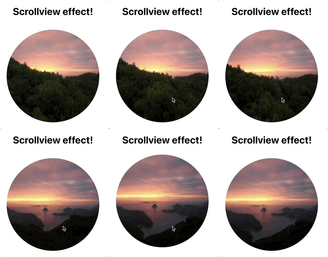
Scrollview is easy to use and an useful app that helps moving images by scrolling the webpage.
😺🌈 Catbow tips!
Have you got a video that you would like to to make as scrollview effect as above?
You can covert your video (less than 30s) to photos for free from catbow converter!
website : https://catbow.github.io/catbow-photo-converter/
Installation
$ npm i react-catbow-scrollview
You can make a code section and edit setting as below:
const option = {
    imgUrl: './images/004/', //  Address before image
    videoImageCount: 754, // Total-number-of-images
    startNum: 10000, // Image-path-start-number
    extension: '.jpg', // Available-with-any-image-extension
    scrollAreaY: 50000, // scrollArea,
    top: 20 // top: 20px
    viewPort: {
        // all-imgTag-styles-available
        width: '500px',
    },
};
// Render
<ScollView option={option} viewItem={<Components />} setEjectRatio={setEjectRatio}/>;
// viewItem is optional
// you can render Components in ScollView
// setEjectRatio is optional
// you can get ImageCount ratio
❉❉ The image address path must have consecutive numbers.
| option | discription | type |
|---|---|---|
| imgUrl | Address before image | String |
| videoImageCount | Total-number-of-images | String |
| startNum | Image-path-start-number | Number |
| extension | Available-with-any-image-extension | String |
| scrollAreaY | scrollArea | Number |
| viewPort? | img-style | Object |
| top? | css style top | Number |
| viewItem? | Jsx components can be rendered in ScrollVIew | JSX Components |
| setEjectRatio? | you can hooks From the parent component and get ImageCount Ratio(return number) | setState => number |
How to use viewItem option
you can try Components styling,
You must use css 'position absolute' at the top of Components
// this is components
export default function Hello() {
    return (
        <div style={{ top: '10px', position: 'absolute' }}>
            <h1 style={{ fontSize: '5rem' }}>hello world</h1>
            <h1 style={{ marginTop: '600px', fontSize: '5rem' }}>
                React-catbow-ScrollView
            </h1>
        </div>
    );
}
//
function App() {
    const option = {
        videoImageCount: 754,
        imgUrl: './images/004/',
        startNum: 10000,
        extension: '.jpg',
        scrollAreaY: 4970,
        top: 30,
        viewPort: {
            width: '550px',
            height: '550px',
            margin: '100px 100px',
            borderRadius: '9999px',
        },
    };
    return (
        <ScrollView
            option={option}
            viewItem={<Btton />}
        />
    );
}
👉 Catbow Github
😺🌈 Catbow tips!
if those names of images are like 'IMG1', 'IMG_2'....'IMG_100' (because in the example on the top, the image names are composed of numbers only) you should set the option as below. the part of the name `IMGshould be inimgUrland numbers should be instartNum`
please look carefully the option of
imgUrl,videoImageCount&startNum
const option = {
    imgUrl: './images/004/IMG_', //  Address before image
    videoImageCount: 100, // Total-number-of-images
    startNum: 1, // Image-path-start-number
    extension: '.jpg', // Available-with-any-image-extension
    scrollAreaY: 50000, // scrollArea,
    top: 20 // top: 20px
    viewPort: {
        // all-imgTag-styles-available
        width: '500px',
    },
};
<ScollView option={option} viewItem={<Components />} />;
Detailed explaination
1. Explained with JSDoc for your better understanding
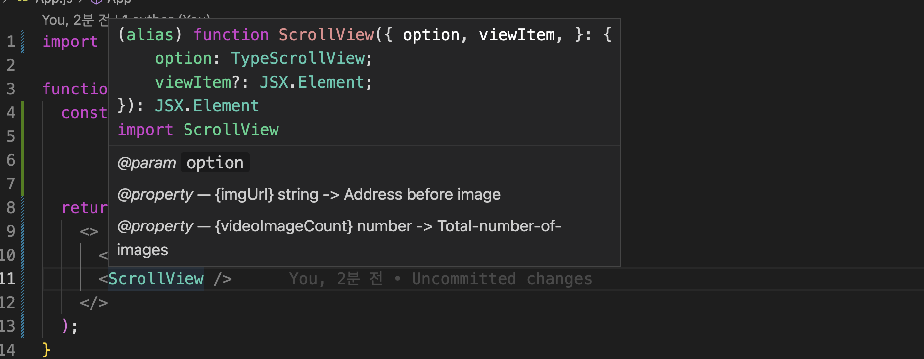
Scrollview supports to show how to set the options in the Code Editor. You can just hover the cursor on the component!
If you still don't understand certain things, please refer to the options in the README.md on Github react-catbow-scrollview repository.
2. position: sticky
Scrollview component has the CSS position: sticky property because the bunch of images should not disappear from the screen.
Therefore, you should keep the following situations in mind and style them.
a. If it's not set as full screen, you should decorate the surroundings, or it would be showing as below.

when it is set as a full-screen, the result would be:

const option = {
    videoImageCount: 754,
    imgUrl: './004/',
    startNum: 10000,
    extension: '.jpg',
    scrollAreaY: 6000,
    viewPort: {
        width: '100vw',
        height: '100vh',
    },
};
B. the scroll area : ScrollAreaY increases the playback length.
Each user would have their own desired percentage, so if you increase it to 100 units step by step and test it, you will get your desired percentage.

const option = {
    videoImageCount: 754,
    imgUrl: './004/',
    startNum: 10000,
    extension: '.jpg',
    scrollAreaY: 100000, // It's hard to scroll because it's 100,000.
    viewPort: {
        width: '100vw',
        height: '100vh',
    },
};
3. viewPort is <img /> Tag itself
This is an example of making a circle with border properties.

const option = {
    videoImageCount: 754,
    imgUrl: './004/',
    startNum: 10000,
    extension: '.jpg',
    scrollAreaY: 10000,
    viewPort: {
        //  img tag!!
        width: '500px',
        height: '500px',
        margin: '100px 100px',
        borderRadius: '9999px',
    },
};
4. viewItem is a special option to render JSX inside
I thought a lot about this option. When I made a library, I aimed to make it easy to use, easy to access This option gives you the option to customize your library At the same time, I felt compelled to act. (But I did!))
I simply added the phrase "hello" as showing below.

There are only two rules to follow.
- For the components to be handed over, make sure to put the css position: absolute property at the top.
- You have to pass it to JSX syntax. If you turn over the prop with the viewItem, it will render inside the component.
// Components to render within ScrollView
function Component() {
    return (
        <div style={{ position: 'absolute', top: '95px', left: '75px' }}>
            <div style={{ fontSize: '150px' }}>hello</div>
        </div>
    );
}

function App() {
    const option = {
        videoImageCount: 754,
        imgUrl: './004/',
        startNum: 10000,
        extension: '.jpg',
        scrollAreaY: 10000,
        // top: 30,  => css top property
        viewPort: {
            width: '500px',
            height: '500px',
            margin: '100px 500px',
            borderRadius: '9999px',
        },
    };

    return (
        <>
            <div
                className='App'
                style={{ height: '1000px', background: 'skyblue' }}
            />
            // When you pass it over, like this!
            <ScrollView
                option={option}
                viewItem={<Component />}
            />
            <div
                className='App'
                style={{ height: '1000px', background: 'skyblue' }}
            />
        </>
    );
}
5. option.top
This is the top option of example code number 4, which is the CSS top property of the view area that moves with position: sticky.
6. Issues
If there are any improvements or bugs while using it, please leave the issue of recat-catbow-scrollview It's a great help to maintain this library!
7. Catbow
Catbow will continue to add libraries that provide easy-to-use, interactive features. I've started with React-components-library first, but I will make it a library that works in other frameworks as well.
Thank you.